Data visualization is the presentation of data in a
pictorial or graphical format. It enables decision makers to see analytics
presented visually, so they can grasp difficult concepts or identify new
patterns. With interactive visualization, you can take the concept a step
further by using technology to drill down into charts and graphs for more
detail, interactively changing what data you see and how it’s processed.
We see a sudden demand for visuals and info-graphics. There
are a lot of visualization software and tools coming up in the market. So why
exactly is visualization important?
Our mind can process huge amount of data if visually present
than in a raw data format.
- It is easy to identify patterns and compare it with others if data is visually represented.
- Easy to identify trends
- Pie charts, bar graphs, line graphs etc are some of the common visualizations used.
Lets observe what are some interesting visualizations that
can be built to understand wide variety of data across following industries:
- Healthcare
- E-commerce
- Insurance
Healthcare
Pictures can provide a large amount of information in a
short amount of time. Most individuals are moved to action by strong emotions.
When they have a visceral response to a stimulus they are often more willing to
take action. Healthcare visualizations are similar to today’s popular
infographics except the data they show is specific to healthcare. With their
easy-to-understand graphical representation of complex data, healthcare
visualizations can be used by anyone involved in healthcare improvements.
Figure 1:

This info-graphic shows pictorial representation of clinical
decision support system adoption across united states.
Data points presented in this graphic are:
1)
CDSS adoption by state in 2007 and 2010
2)
Percentage changes in adoption between 2007 and
2010
3)
Adoption rate by hospital size in number of beds
4)
Total change in CDSS adoption

Figure 2:
This info-graphic shows a dashboard with multiple
visualizations encompassing Bloodbank Inventory Management system for a
Laboratory Information System.
Data points presented in this graphic are:
1)
Wasted units because of expirations with type
and month
2)
Successfully transferred units
3)
Status of present units by type and quantity
4)
Units ordered by type and months
E-commerce
Once ecommerce businesses gather data from a customer’s
activity, account information, geolocation, or social media accounts, they can
use data visualization to make comparisons, identify patterns, or show
relationships. If businesses can see who is visiting and engaging, they can
optimize their conversion process to not only increase sales or leads, but to
create comprehensive strategies.
Figure 1:

This infographic shows the Sales performance of an
e-commerce company over a period of time with demographics of customers all
over India.
Data points presented here are:
1)
Gross Sales by State
2)
Male and Female Customers share sub divided into
age groups
3)
Male and Female Customers share sub divided by
payment method
4)
Male and Female Customers share sub divided by
device/platform used
5)
Percentage changes over a period of time in
metrics like No.of customers, No. of orders, Items/Order, Returns rate etc.,
Figure 2:

This infographic shows the daily brand mentions of the brands
sold on e-commerce websites all over India.
Data points presented here are:
1)
Brand mentions over a period of time with a
trend dotted line
2)
Identifying peaks and a reason being presented
with the exact tweet related to a sales or contest by an e-commerce website
Insurance
Policies. Premiums. Claims. Payouts. Every transaction is a
data point ripe for analysis and action. Realizing how quickly we understand
and internalize what we see is at the foundation of what makes data
visualization such an important aspect of how we analyze information and make
better decisions.
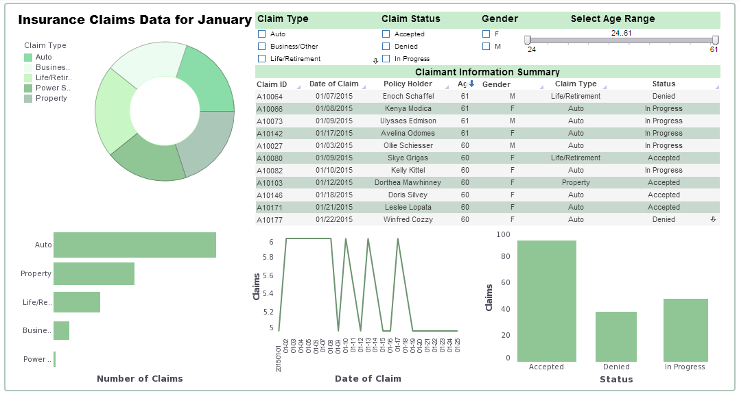
Figure 1:

This infographic shows the dashboard of insurance manager
with Claims analysis for the month of January.
Data points presented here are:
1)
Claims by type of insurance
2)
Claimant information summary with details like
ID, Age, Gender, Status etc.,
3)
Claims by date of claim
4)
Claims by status
Figure 2:

This infographic shows the dashboard for a competitive
analysis of insurance industry by state of United States.
Data points presented here are:
1)
Largest Insurers market share
2)
Insurance with >5% market share
3)
HHI
4)
Individual HHI index by state
5)
Small group and large group HHI index by state
No comments:
Post a Comment